How to use Tailwind CSS in Vue together with CSS Modules
This article has been published a while ago.
If this is a technical article some information might be out of date. If something is terribly broken, let me know and I will update the article accordingly.
Update 12.07.2018
Today Adam released 0.6.2 of Tailwind CSS and this releases fixes the core problem I faced while writing this article: The final bundle size was just too big, that this approach could be used in any production application.
0.6.2 changes that by adding shadowLookup. The @tailwind utilities directive no longer has to be added into every Vue component, but you can still use the @apply directive in your components to write your CSS classes.
I've changed the repository mentioned in the article with this pull request. I've also striked through and edited some of the text parts, which are no longer important.
Today I would like to show you a cool way how you can use Tailwind CSS together with Vue Single File Components. As an extra, I will show you how you can use CSS Modules to scope/namespace your CSS.
TL;DR #
- CSS Modules and Vue components changed the way I write CSS in larger projects
- Tailwind CSS delivers a great toolkit to design your app/website in the browser by restricting you to a defined set of rules.
- You can check out the GitHub Repository with the source code of this article. There are also pull requests which show detailed diffs what has changed.
Short Introduction why this post exists #
One part of my day job is to write JavaScript widgets. Our customers can place widgets in their websites to allow their users to signup for certain services. (like booking a table at restaurant.) In late 2017 we've decided to rewrite our widgets in a new tech stack to be more flexible for business features and to abandon legacy code we've tragged with us for the last 8 years 😩.
We've decided to use Vue as we've used it on a smaller scale in other parts of our projects and were very happy with it.
One issue we've always faced over the years is scoping and namespacing CSS. As described above, our customers insert our widgets directly into their website (They place a <script>-tag in their site and the widgets get's injected into it).
Our problem was that CSS rules for HTML root elements like <a>, <p> or <h1> interfered with the design of our widgets. Of course we could use !important in our widgets, but that's just not a sustainable way to write CSS.
We previously solved this problem by prefixing our widget CSS with SASS.
This solved some of the CSS collision problems but it was quite cumbersome to use the prefix in the code.
While evaluating our next tech stack I discovered "scoped CSS". Vue's Single File Component comes with scoped CSS support out of the box. Right there in the documentation I discovered CSS modules and started reading a lot more about it.
But wait, why don’t you just use iframes?! #
The widgets we create are actually very powerful, applications. They have different screens/pages which changes the size of the widget 1 and many features need access to window objects of the parent site. Iframes just don't fit our requirements ¯\(ツ)/¯.
About CSS Modules #
CSS Modules is best described in this quote:
CSS Modules is a concept of using a module bundler such as webpack to load CSS scoped to a particular document.
Let's say you have the following CSS:
.card {
    padding: 2em;
    border: solid 1px #ddd;
    border-radius: 4px;
}
During your build process CSS Modules will parse it, convert it into a JavaScript object and change the class name to a random string. Depending on your configuration the final rendered HTML will look like this.
<div class="card_acgdjumr">Content</div>
By replacing the .card class name with a random string the styling is being scoped to your component.
If a parent site also implements a .card class, it will no longer interfere with your .card_acgdjumr class.
The cool thing about CSS modules is, that you can reuse CSS classes of other CSS files. For example if you have a color.css file in your project which contains all available text colors in it, you can use them in like this:
.card {
    composes: textRed from './typography.css';
}
If you use .textRed in multiple components CSS modules is clever enough to import the CSS class only once and therefore reducing the bundle size significantly.
If we take our .card example, the final HTML would look like this:
<div class="card_acgdjumr textRed_rskkp">Content</div>
Tailwind CSS? What's that? #
Tailwind CSS is a utility-first CSS framework. I've used other utility based CSS frameworks before, like Tachyons or BassCSS, but none of the them provided a great toolset to move your utility classes to components.
Tailwind is built with PostCSS and comes with a handy @apply directive to build components out of utility classes.
What I especially like about Tailwind is its configuration file. In it you define your colors, spacing levels and font weights.
I think it's a great way to keep the CSS of a project maintainable by just using the @apply directive and the colors defined in your configuration file. No longer you have to remember which HEX-colors is your primary one or use different magic numbers for your paddings and margins.
You just use @apply text-primary and your good to go.
Together with CSS modules, utility first CSS frameworks are a powerful tool to write more manageable CSS in bigger JavaScript projects. (If you want to know more about utility based CSS frameworks I highly recommend reading Adam Wathans article about that topic).
Let’s get started: How do you use all those things in a real project? #
So how do we get all the parts together? Let's create a very simple Vue application. As I often work with Laravel and I would like to keep this post a short as possible, I will use Laravel Mix to keep my webpack configuration simple.
You can see the following changes also in this pull request on GitHub.
Setup Files and Folders: #
npm init -y # Create an empty package.json
yarn add vue tailwindcss laravel-mix cross-env
touch webpack.mix.js
touch postcss.config.js
mkdir src
mkdir src/js
touch src/js/main.js
mkdir dist
touch dist/index.html
Add the following commands to the scripts block in your package.json
  "scripts": {
    "dev": "cross-env NODE_ENV=development node_modules/webpack/bin/webpack.js --progress --hide-modules --config=node_modules/laravel-mix/setup/webpack.config.js",
    "watch": "cross-env NODE_ENV=development node_modules/webpack/bin/webpack.js --watch --progress --hide-modules --config=node_modules/laravel-mix/setup/webpack.config.js",
    "prod": "cross-env NODE_ENV=production node_modules/webpack/bin/webpack.js --no-progress --hide-modules --config=node_modules/laravel-mix/setup/webpack.config.js"
  },
This will allow us to create a dev build (npm run dev), a production build (npm run prod) and watch for changes (npm run watch).
Setup webpack.mix.js #
const { mix } = require('laravel-mix');

mix.setPublicPath('dist/');

mix.js('src/js/main', 'dist/js/main.js');

// This bit of configuration updates the generated class names from CSS Modules. It will keep the original name (eg. card) in the final class name
mix.webpackConfig({
    module: {
        rules: [
            {
                test: /\.vue$/,
                loader: 'vue-loader',
                exclude: /bower_components/,
                options: {
                    cssModules: {
                        localIdentName: '[local]--[hash:base64:5]',
                        camelCase: true,
                    },
                },
            },
        ],
    },
});
Setup postcss.config.js #
As we want to use Tailwind in our Single File Components we have to tell webpack and PostCSS that Tailwind exists.
We do this by adding a postcss.config.js file to the root of our project.
module.exports = {
    plugins: [require('tailwindcss')('./tailwind.js')],
};
Setup Tailwind #
At the time of writing this article the current version of Tailwind was 0.4. Things might change the time your reading this. The documentation tells us to create a new config file:
./node_modules/.bin/tailwind init tailwind.js
You can change the configuration if you like, but for the sake of simplicity I wont change it for this post.
Setup main.js #
Next on our list is the actual JavaScript file. We just import Vue and bind it to an element with the id of #app.
import Vue from 'vue';

var app = new Vue({
    el: '#app',
    components: {},
});
Setup index.html #
Lastly we create a HTML file to see our widget in action.
<!DOCTYPE html>
<html>
    <head>
        <meta charset="utf-8" />
        <meta name="viewport" content="width=device-width, initial-scale=1" />
        <title>Vue + Tailwind + CSS Modules</title>
    </head>
    <body>
        <div id="app"></div>

        <script src="/js/main.js"></script>
    </body>
</html>
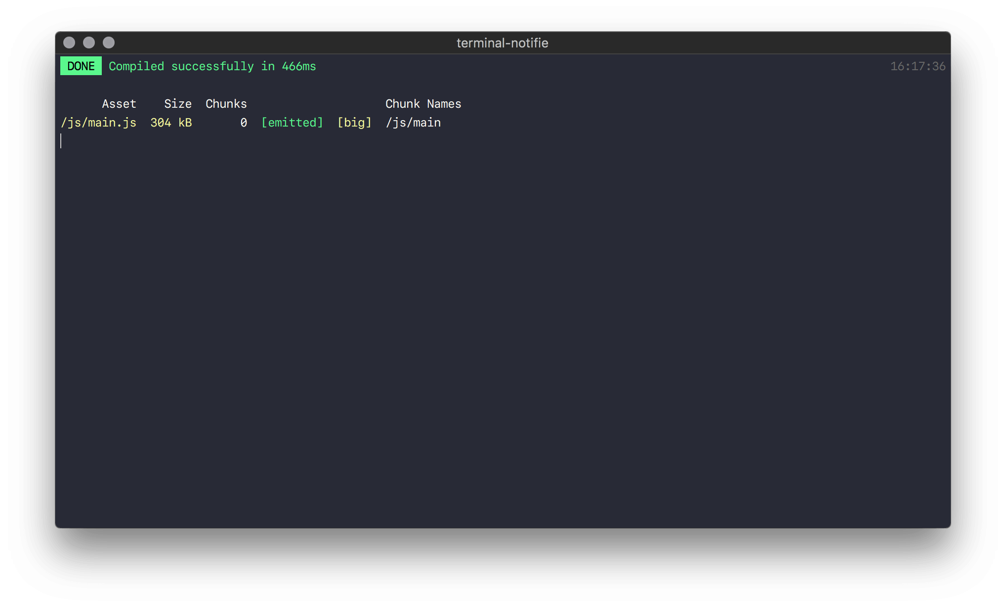
Now all essential files are in your project and you should be able to compile the JavaScript file by running the watch command.
npm run watch;
If everything works as expected you should see the following result.

Write and design our Vue application #
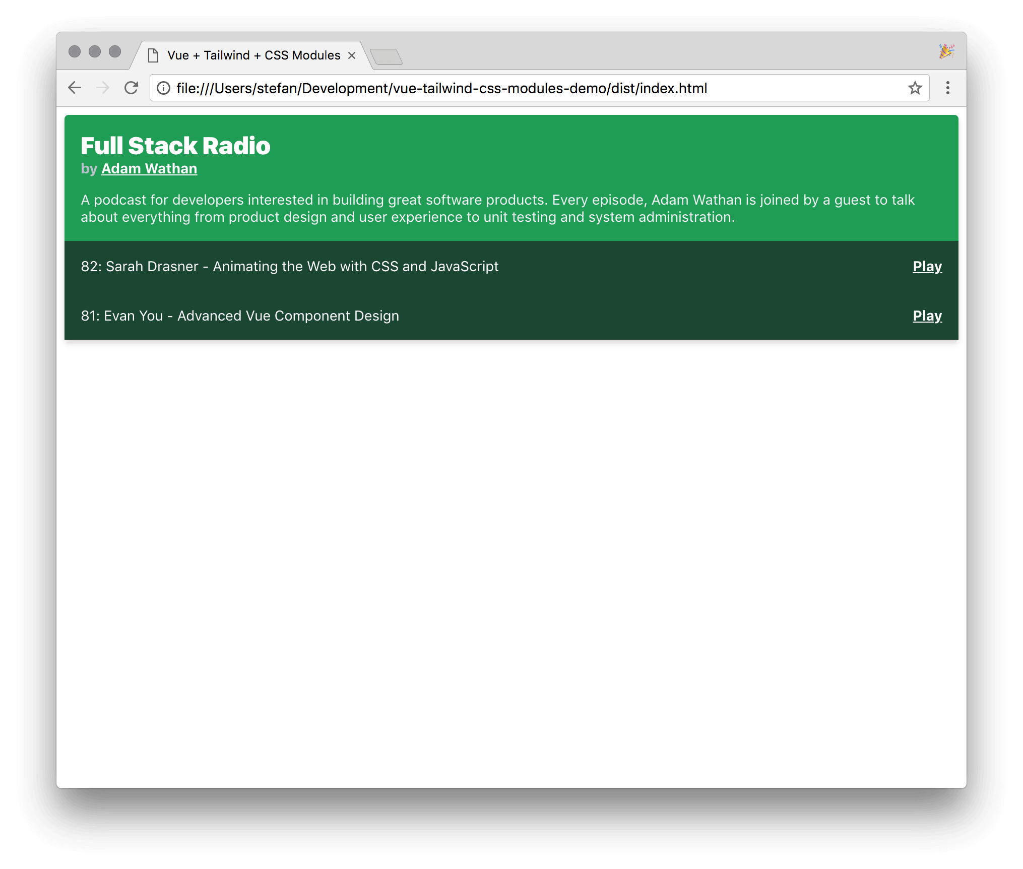
Now that your project is ready we can start writing our Vue application. Let's build a very simple Podcast widget. This is what we want in the end.

The widget will be built out of 4 simple Vue components:
PodcastWidgetPodcastDescriptionEpisodesContainerEpisode
Below you see the source of each component. I won't go into much detail here as each component is very simple and easy to understand.
Once thing you might be unfamiliar with is the :class="$style.className" syntax. This comes from CSS modules which we use by adding the module keyword to our <style>-block.
You also see that we import Tailwinds utilities in each style-block with Since Tailwind 0.6.8 you no longer have to add @tailwind utilities. Thanks to that, you can use the @apply directive to write your CSS classes.@tailwind utilities in each component.
You can see the following changes also in this pull request on GitHub.
PodcastWidget.vue #
<!-- src/js/components/PodcastWidget.vue -->
<template>
    <div :class="$style.player">
        <podcast-description :podcast="podcast" />
        <episodes-container :episodes="episodes" />
    </div>
</template>

<script>
import PodcastDescription from './PodcastDescription.vue';
import EpisodesContainer from './EpisodesContainer.vue';

export default {
    components: {
        PodcastDescription,
        EpisodesContainer,
    },

    data() {
        return {
            podcast: {
                title: 'Full Stack Radio',
                publisher: 'Adam Wathan',
                description:
                    'A podcast for developers interested in building great software products. Every episode, Adam Wathan is joined by a guest to talk about everything from product design and user experience to unit testing and system administration.',
            },
            episodes: [
                {
                    title: '82: Sarah Drasner - Animating the Web with CSS and JavaScript',
                    length: '50:46',
                },
                {
                    title: '81: Evan You - Advanced Vue Component Design',
                    length: '48:52',
                },
            ],
        };
    },
};
</script>

<style module>
.player {
    @apply antialiased text-white bg-green-dark font-sans rounded shadow-md;
}
</style>
PodcastDescription.vue #
<!-- src/js/components/PodcastDescription.vue -->
<template>
    <div :class="$style.podcastDescription">
        <h4 :class="$style.title">
            {{ podcast.title }}
        </h4>
        <h6 :class="$style.publisher">
            by <a href="#">{{ podcast.publisher }}</a>
        </h6>
        <p :class="$style.podcastDescriptionParagraph">
            {{ podcast.description }}
        </p>
    </div>
</template>

<script>
export default {
    props: {
        podcast: {
            type: Object,
        },
    },
};
</script>

<style module>
.podcastDescription {
    @apply p-4;
}

.title {
    @apply font-black my-0 text-2xl;
}

.publisher {
    @apply text-grey font-bold my-0 text-sm;
}

.publisher a {
    @apply text-white;
}
.podcastDescriptionParagraph {
    @apply mb-0 text-sm text-grey-lighter;
}
</style>
EpisodesContainer.vue #
<!-- src/js/components/EpisodesContainer.vue -->
<template>
    <div>
        <episode v-for="episode in episodes" :episode="episode" :key="episode.title" />
    </div>
</template>

<script>
import Episode from './Episode.vue';

export default {
    components: {
        Episode,
    },
    props: {
        episodes: {
            type: Array,
        },
    },
};
</script>
Episode.vue #
<!-- src/js/components/Episode.vue -->
<template>
    <div :class="$style.episode">
        <span>{{ episode.title }}</span>
        <a href="#" :class="$style.playButton">Play</a>
    </div>
</template>

<script>
export default {
    props: {
        episode: {
            type: Object,
        },
    },
};
</script>

<style module>
.playButton {
    @apply font-bold text-white;
}

.episode {
    cursor: pointer;
    @apply flex justify-between  text-sm p-4 bg-green-darker;
}

.episode:hover {
    @apply bg-green-darkest;
}
</style>
Tailwinds documentation also tells you to use @tailwind preflight. I haven't done this here, as I don't want to reset/normalize root HTML elements.
To see the widget in the browser we have to import our PodcastWidget component in our app.js and reference it in index.html.
import Vue from 'vue';
import PodcastWidget from './components/PodcastWidget';

var app = new Vue({
    el: '#app',
    components: { PodcastWidget },
});
<!DOCTYPE html>
<html>
    <head>
        <meta charset="utf-8" />
        <meta name="viewport" content="width=device-width, initial-scale=1" />
        <title>Vue + Tailwind + CSS Modules</title>
    </head>
    <body>
        <div id="app">
            <podcast-widget />
        </div>

        <script src="/js/main.js"></script>
    </body>
</html>
After recompiling your JavaScript you should be able to see the widget in your browser.
Bonus: Add Bootstrap #
Our index.html currently only holds our PodcastWidget and no other CSS. Let's spicy it a bit up and add Bootstrap CSS.
You can see the following changes also in this pull request on GitHub.
<!DOCTYPE html>
<html>
    <head>
        <meta charset="utf-8" />
        <meta name="viewport" content="width=device-width, initial-scale=1" />
        <title>Vue + Tailwind + CSS Modules</title>
        <link
            rel="stylesheet"
            href="https://maxcdn.bootstrapcdn.com/bootstrap/4.0.0/css/bootstrap.min.css"
            integrity="sha384-Gn5384xqQ1aoWXA+058RXPxPg6fy4IWvTNh0E263XmFcJlSAwiGgFAW/dAiS6JXm"
            crossorigin="anonymous"
        />
    </head>
    <body>
        <nav class="navbar navbar-expand-lg navbar-dark bg-dark mb-4">
            <div class="container">
                <a class="navbar-brand" href="#">Vue + Tailwind Demo</a>
                <button
                    class="navbar-toggler"
                    type="button"
                    data-toggle="collapse"
                    data-target="#navbarSupportedContent"
                    aria-controls="navbarSupportedContent"
                    aria-expanded="false"
                    aria-label="Toggle navigation"
                >
                    <span class="navbar-toggler-icon"></span>
                </button>
            </div>
        </nav>

        <div id="app" class="container">
            <div class="row">
                <div class="col">
                    <div class="card">
                        <div class="card-body">
                            <h5 class="card-title">Card title</h5>
                            <p class="card-text">
                                Some quick example text to build on the card title and make up the
                                bulk of the card's content.
                            </p>
                            <a href="#" class="btn btn-primary">Go somewhere</a>
                        </div>
                    </div>
                </div>
                <div class="col">
                    <podcast-widget />
                </div>
            </div>
        </div>

        <script src="js/main.js"></script>
    </body>
</html>
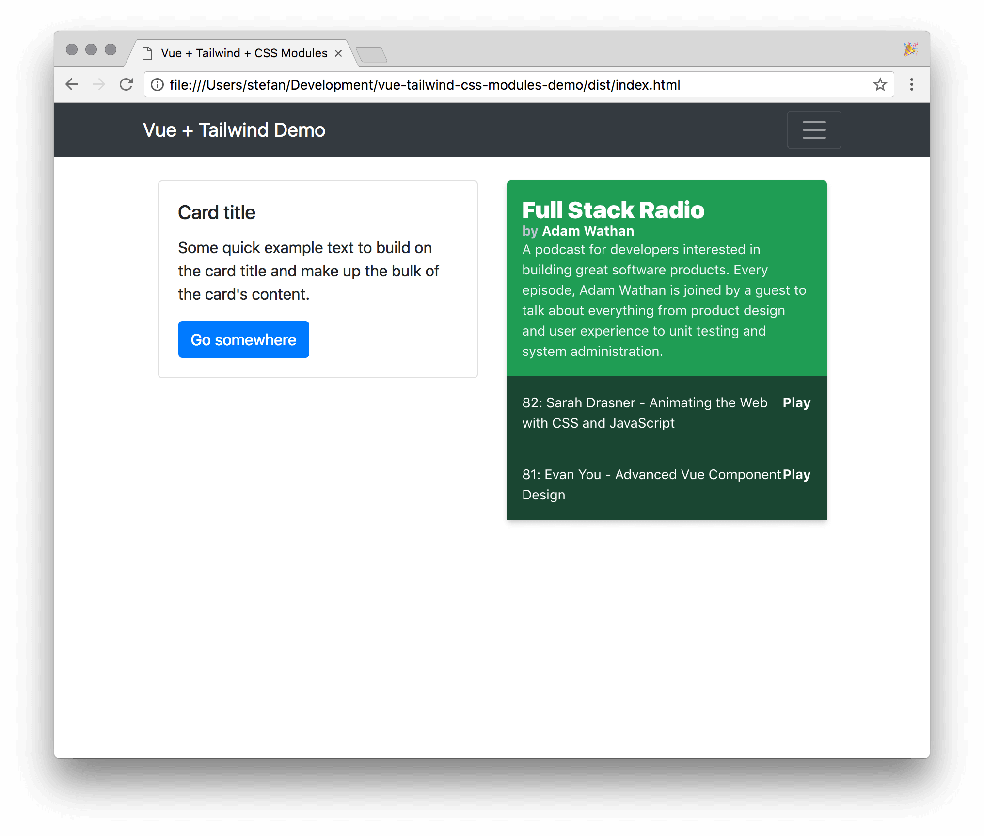
If you refresh your browser you should see the a Navbar and a Card styled by Bootstrap and your PodcastWidget styled by Tailwind.

Conclusion #
Doesn't this look like a cool way to design your components? But now comes the part where I have to tell you the downsides of this approach:
As you might have noticed, I've added
@tailwind utilities into every style-block in every Vue component. When you recompile your JavaScript file, it gets HUGE. For each component, the entire Tailwind utilities are added to your bundle. This adds up.This little app has only 3 components but the production build is already 2MB in size. That's just unacceptable for any production app.
However, as utility frameworks gain more and more traction I'm sure that in the near future we will be able to write CSS similar as described in this article without bloating our bundles with CSS we don't use.
Adam Wathan released Tailwind CSS 0.6.8 which resolves the file size issue I encountered in an earlier version of this article. After upgrading Tailwind CSS the bundle file size went from 1.9MB to just 99kb (The upgrade process is documented in this pull request). I think with this release, this approach of writing CSS in Vue.js projects is finally ready for production applications. Another benefit of using Tailwind CSS in conjunction with Vue.js is, that only your final bundle will only contain the CSS classes which are actually needed. No need to add purgecss or similar tools to your pipeline.
I for sure can't wait to add Tailwind CSS to my Vue.js projects.
Thanks for reading! If you found this article helpful I would appreciate if you tell me by mail or messaging me on Mastodon. I really like writing longer essays about a particular technical problem. If enough people find this stuff interesting, I will publish more throughout the year.
If you're generally interested in designing with Components and Styleguides I highly recommend reading the following articles by Daniel Eden. The really helped me to understand the potential of working and designing with Components:
- https://daneden.me/2017/03/29/designing-systems/
- https://daneden.me/2017/06/02/casting-graphite-in-gold/
- https://daneden.me/2017/06/27/paving-the-path-of-least-resistance/
- https://daneden.me/2017/07/17/design-system-structure/
And here are some other links that might be useful for you:
- https://glenmaddern.com/articles/css-modules
- https://github.com/css-modules/css-modules
- https://github.com/styled-components/styled-components
- https://github.com/paypal/glamorous
- https://github.com/emotion-js/emotion
-
I'm aware that there are solutions to this problem. iframe-resizer is a tool I've used in the past. ↩