Asana Expander: A browser extension to fix Asana's UX problems
We've been using Asana for the better part of a year now to manage our projects and tasks at work. It's … okay. I can create tasks, add deadlines, comment on tasks made by others and mark tasks as completed.
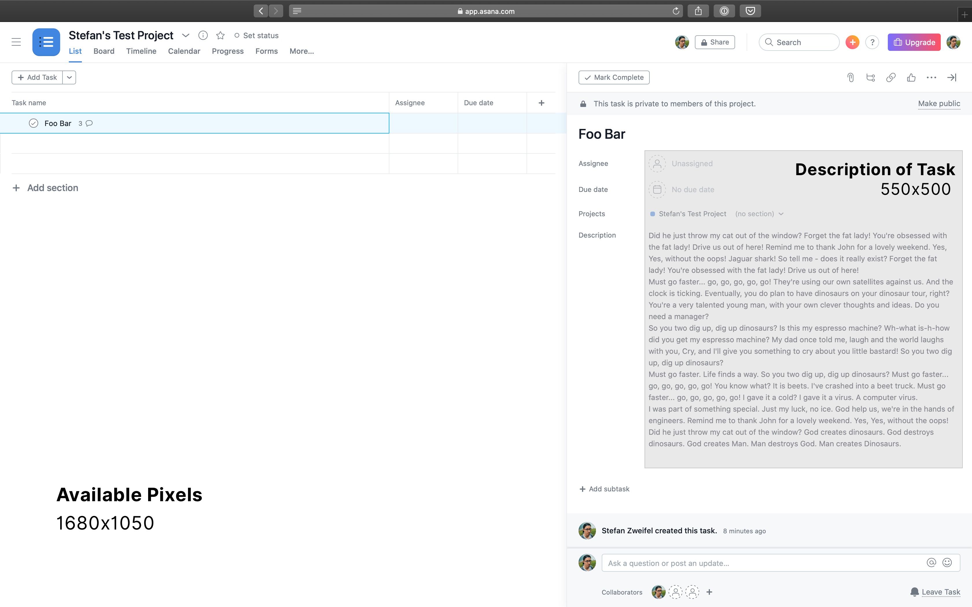
But, the UI, in my opinion, is horrible: The interface is cluttered with links, buttons and tabs. Action become only visible when you hover over certain fields or know the right keyboard shortcut. Features are tucked away in dropdown menus. The description of a task, probably the most important bit of it, only takes up roughly 15-20% of the available space. The list goes on.

My two biggest gripes I have with Asana, are the following:
- Asana truncates all but the last comment, if the comment contains more than 300 characters.
- If there are more than 6 comments in a task, the older comments are hidden behind a "$n more comments" link. I have to click the link to see the older comments.
It's baffling to me, why a project management software hides the content of tasks from its users. In the current situation, where everyone works from their home offices, we have lengthy discussions back and forth about how to tackle a problem. In addition, we write in German. A language famous for it's long words and sentences.
Long story short: As I don't want to waste my time clicking on "show more" links all the time, I've written a browser extension to solve this problem for me.
The "Asana Expander"-extension automatically clicks on those "$n more comments" and "show more" links for me whenever I open a task.
You can install the extension from the Chrome Web Store or from Firefox Add-Ons:
If you're interested in the source code for the extension you can browse through the code on GitHub.
Update 2026-03-16 #
Andy Frost reached out to me asking if he could fork the project and keep it up to date. I agreed and he published new versions of the extension on the Chrome Web Store and Firefox Add-Ons.
You can find the source code for Asana Expander v2 on GitHub.
As I'm already in the mood, here's another gripe I have with Asana: Their mail notifications are garbage. I have to look at the mail for 15 seconds to understand what exactly has happened and how it affects me.