Building the "What Are You Doing With Your Life" Visualisation
TL;DR: I created an app which visualises the weeks you have left to live. Check it out here.
In May 2021 the YouTube Channel Kurzgesagt released a video called "What Are You Doing With Your Life? The Tail End".
The video sets the length of a human life into perspective by breaking it down into 5200 weeks. The amount of weeks a person has available to them, if they live 100 years.
In a crass way, the video visualises the time you spend in school or at work with the time of your childhood or retirement.
The video resonated with me. Especially the last act, where it's all about connections. Each time you see a friend or your loved ones, it could be the last time.
Anyway … I liked the visualisation of weeks as bubbles Kurzgesagt used in their video.
The video kept lingering in my head for a couple of days and I wondered, how many weeks and days I have left with my loved ones. I wanted to build a web app where I could enter my age and country and it would spit out the the data.
I wrote a note and regularly saw the task in Things.app. "Next month you have time for this" I told myself in the summer of 2021.
Now, a year later in August 2022 I got interested in TypeScript and wanted a project to test my newly learned skills. The "Life Expectancy Visualiser" was a perfect little project that I could write in TypeScript.
Gathering Data and Development #
First I needed to know how long people live on average in the different countries on this planet. Thankfully there is ourworldindata.org where I could find life expectancy data from 2019. (They also have great visualisations; check them out).
With such projects, I ususally build a prototype in Numbers/Excel first. It's a good indicator, how complex the problem is I want to solve – before diving into code.
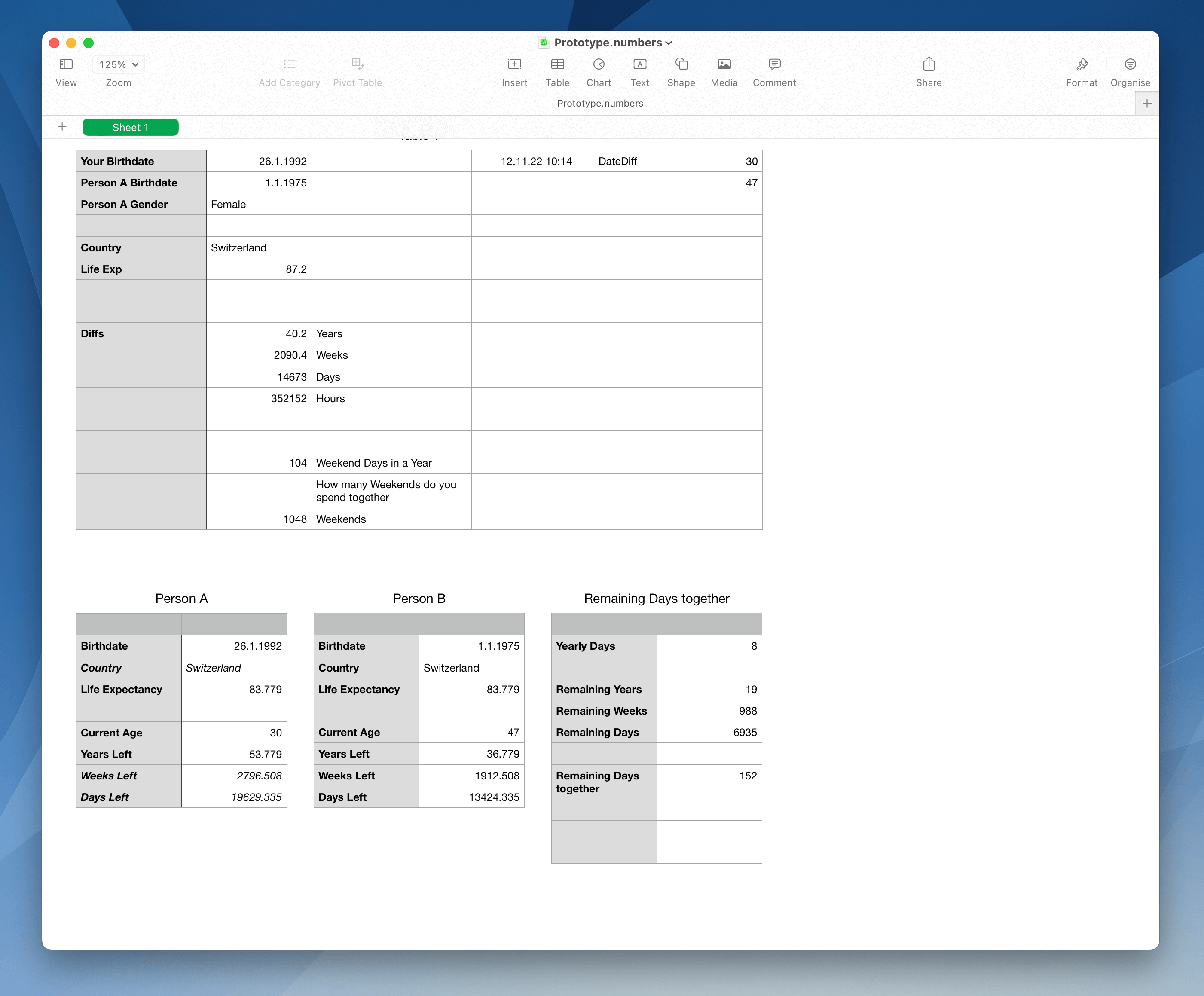
After building the concept in Numbers, development started.
I created a new Vue.js-project (with TypeScript support) and started building out the app. Form fields to select age and country for multiple persons, code that does all the calculation, code to visualise the days/weeks/years left to live and adding TypeScript types.
Using Vue.js with TypeScript and Pinia was easy. I'm a big fan of type-safety and TypeScript highlighted a couple of bugs in my code I would never have encountered in this side project. Both TypeScript and Pinia are tools I can use in future projects.
The hardest engineering part of this project was the visualisation.
As in the video, I wanted to display the number of total weeks and "lived" weeks as circles.
If we take the world average life expectancy of 73 years and multiply that with the number of weeks per year (52), we get 3796 circles to render. Add another person and the app needs to display 7592 circles. That's a lot of DOM elements.
The first mistake I made was creating a Vue component for a single week circle. I called it WeekIndicator.
Vue.js can handle rendering the ~7500 instances of that component fine, but the DevTools regularly broke or froze. Understandibly, as it tried to gather data for 7500 components currently rendered on the page. And 99% of those components rendered a single div in 2 different colors.
Using Vue components for those circles increased the memory footprint of the page. Performance tests showed the app using up to 100 MB of memory.
I appandoned the components and implemented the circles by inlining the div-elements.
But using display: flex and simple div-elements felt wrong to me as a visualisation solution. (I'm not that much of a specialiced frontend developer, but always thought visualisation and charts are best made in SVG.)
A long time ago I made a note in my head about D3.js, a data visualisation library for JavaScript. After scrolling through examples and their API documentation I was more confused than before, but tried adding it to the project anyway.
I could replicate the "life calendar" chart with D3, but it didn't use SVG. I let D3 create 3796 div-elements and again used display: flex for the layout.
I remove D3.js again, as the performance problem obviously persisted. The app still rendered 3796 DOM elements.
Switching to SVG wouldn't have helped either. I would have had a svg element with 3796 child nodes in it. And positioning the cirlces would have been a lot of work, as SVG doesn't support flexbox or something similar easy to use.
The best solution would have been using the canvas-element and paint the circles on to the canvas. I didn't had prior experience with using canvas and just wanted to deploy this.
As this was a little side project I kept my implementation using div-elements.
Fuck it; Ship it #
In early November I haven't shiped this thing.
Evening after evening I looked at the same screen and couldn't find a good design that would make the site better or prettier to look at.
I also – still – haven't found a solution for my performance problem concerning rendering thousands of DOM elements.
One day I thought to myself: "Fuck it; Ship it". Instead of agonizing the next couple of weeks on how I could make this thing perfect, it's better to ship what you got.
On a cold, rainy November evening I finally hit the deploy button and made the app public for all. It's now live on life-expectancy-visualisation.pages.dev and the source code is available on GitHub.
Is this my best work? Hell no.
But it was a fun project. It was the first time where I used TypeScript in a real Vue.js project and the first time I installed and used Pinia.